New Old Cards

Generated Quest Sequences
5 March 2020
Factions and Achievements
25 March 2020Welcome in a new Development Diary post of the adventure game – The Descendants of Volos!
If you haven’t read the previous posts yet, here they are:
Post 1 – Game announcement
Post 2 – World map and Tutorial
Post 3 – Event cards
Post 4 – Equipment
Post 5 – Enemies and Combat
Post 6 – Dungeons
Post 7 – Setting up a player character
Post 8 – Character Portraits
Post 9 – Grand Changes
Post 10 – Intellect and Snaaga
Post 11 – Generated Quest Sequence
Today we are going to write about some important major changes that we’ve been silently working on for a couple of months. So, let’s begin…
Cleaner UI
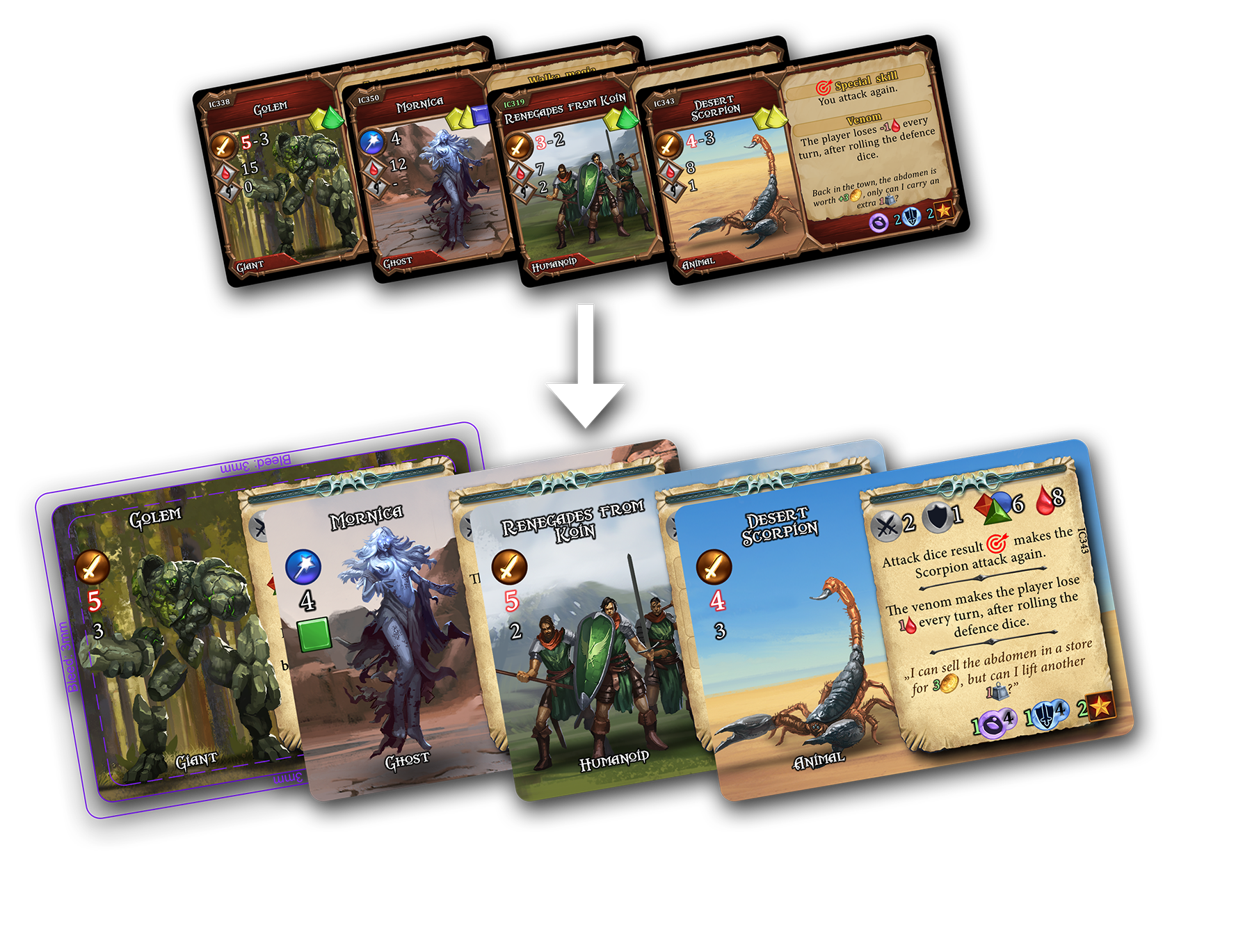
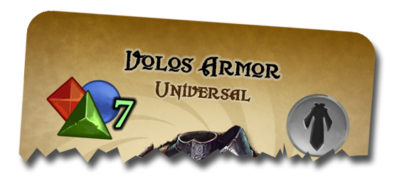
The previous look of the cards had a very nice feeling to it, somewhat in a mood of oldschool games. However, we’ve come to realize that the UI design was actually a weak side. We’ve made many basic mistakes. The first one was about the frames. They not only took some precious space around the card, but also took the player’s attention away, obscured the important information and left little space for a very important thing – the image.
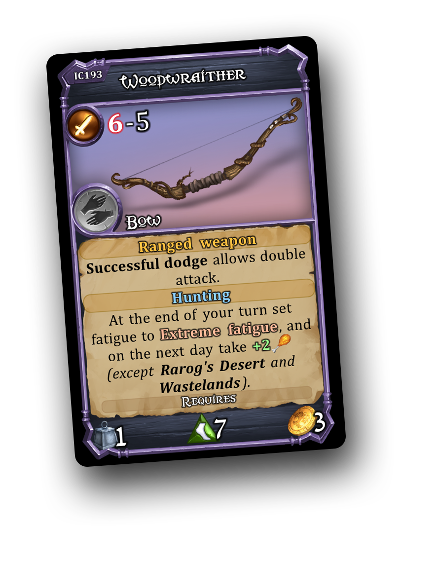
Above – the old version of the item card interface.
When we began preparing the cards for professional printing, we’ve learned that many manufacturers recommend leaving up to 3mm of margin for potential cutting errors! To follow that recommendation we’d have to scale the existing content down by ~11%, to make sure that if an error in happens in the cutting phase, the card is still going to be playable. 11% down on an already tiny card was unacceptable.
So we’ve decided to redesign the cards entirely!
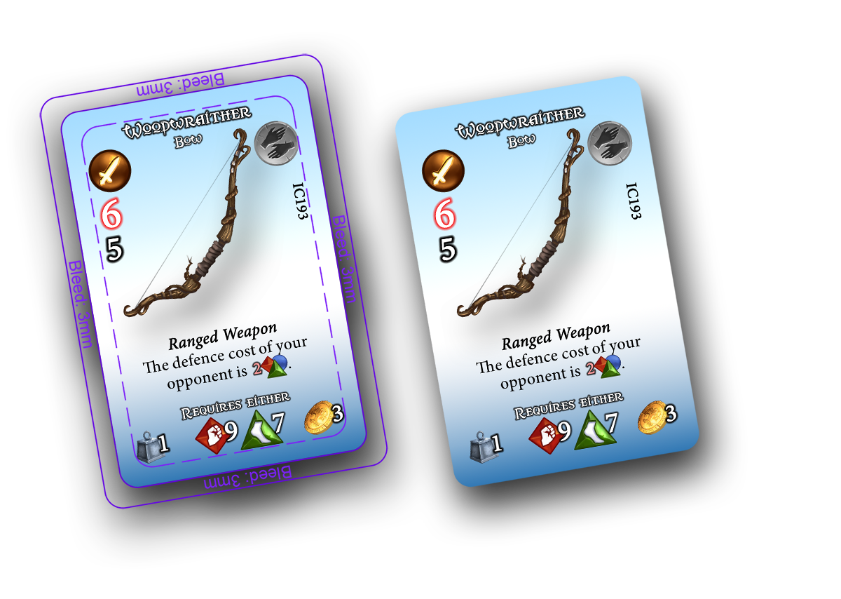
Above – new interface without any frames – however not a final design yet.
Now, maybe it doesn’t have as nice a mood and feeling as before, but it’s surely much cleaner and it follows the manufacturers’ recommendations. As you’ve noticed, we’ve also made the skills much lighter and easier to remember. We did that with almost all of the cards but at the same time we made sure we didn’t destroy the immersion. In the case of the above bow, the new skill makes more sense, because it is supposed to be much harder to defend from ranged weapons (opponent defence cost is 2 combat cards).
Size Matters
Almost all cards in our game follow the smallest possible standard – the micro. They’re really, really small. The main reason is that there are many different stacks. Making them all big will take a lot of space on the table. There are: items, trinkets, companions, adventure decks, combat decks, talents etc.
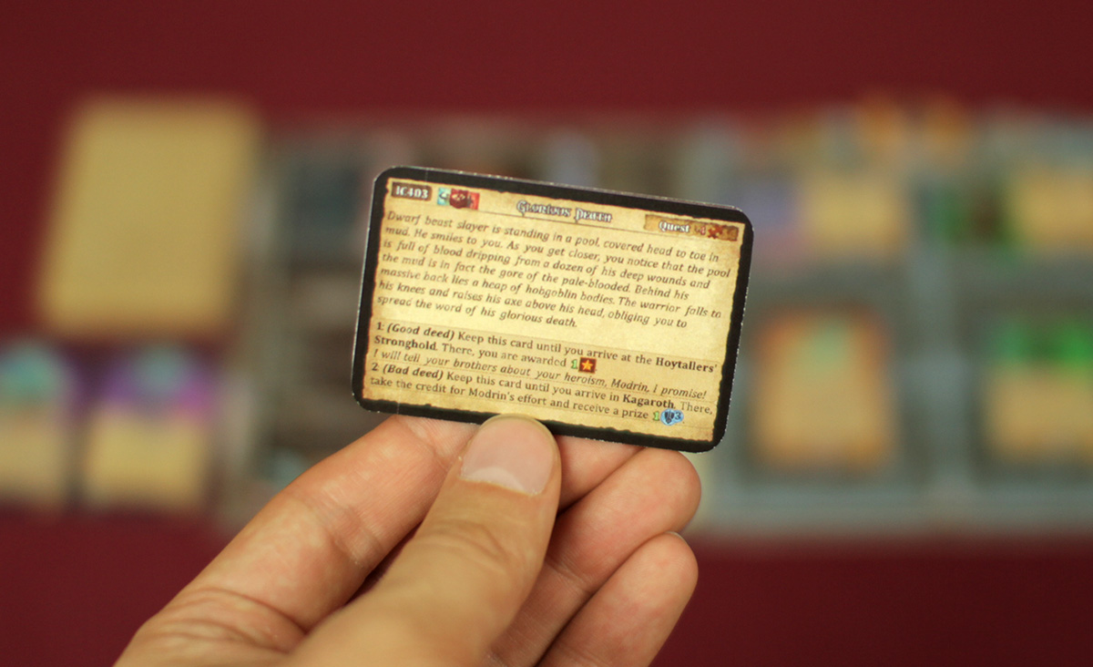
The problem shows up in the adventure cards where we put a lot of text on a very small surface:
Above – an example adventure card as a micro size, before we decided to increase it’s size.
It’s very hard to describe an interesting situation with just a few words. So the text had to be small in order for it to be fancy. Personally we didn’t have any problems with the tiny size of text, but some older people just couldn’t read it. However we couldn’t scale them up just like that. That’s because the adventure decks don’t contain only the cards with a text such as a situation or a quest. They also contain items (found just like that), or an enemy that you must fight. We couldn’t scale up the entire deck, because the bigger items would demand a bigger player panel – after all you must be able to put them on. A bigger player panel would then require us to make the world map smaller, because 2 players sitting in front of each other with their panels, plus the world map, would exceed the size of an average kitchen table. One small change that triggers a chain reaction in so many things…
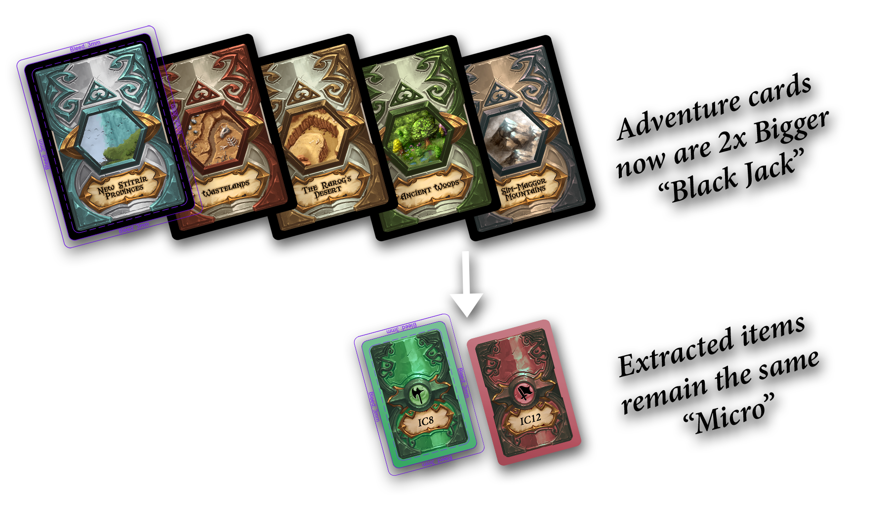
But we’ve found a solution. We’ve decided to separate the items that could be found “just like that” from the adventure cards and make 2 separate decks. “Yay 2 more decks!” you’ll say. But that’s how all the items will keep their micro size. We’ve scaled up only the 5 adventure stacks to the Black Jack, which is exactly 2x bigger.
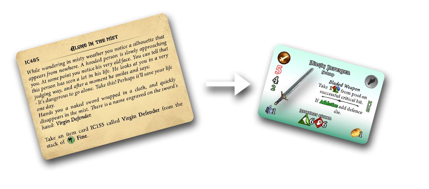
As you see, the two new item stacks have item codes on their reverse. That’s because you’re not going to draw random cards from these stacks, but search for a specific item instead. After removing items from the adventure stacks we had to insert a new type of adventure cards that substitute for the items. Those new adventure cards are simply some situations explaining how you acquired an item that you’ve previously found “just like that”, or even describing its history and lore.
With the new design, everything makes more sense. Before, you could only imagine in what circumstances you obtained an item. Now the situation is explained in details.
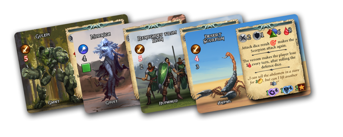
The last thing that needed changing were the cards with enemies as they’re also part of the adventure decks. We’ve also decided to simplify the interface by removing the frames and making the character images bigger and clearer. So now they’ll have exactly the same size as the cards of bosses and champions (Black Jack), which is good because consistency matters.
That’s it for today, but not for the changes. We’re fixing much more stuff, but we’ll write about that in the next development diary of the Descendants of Volos board game.
